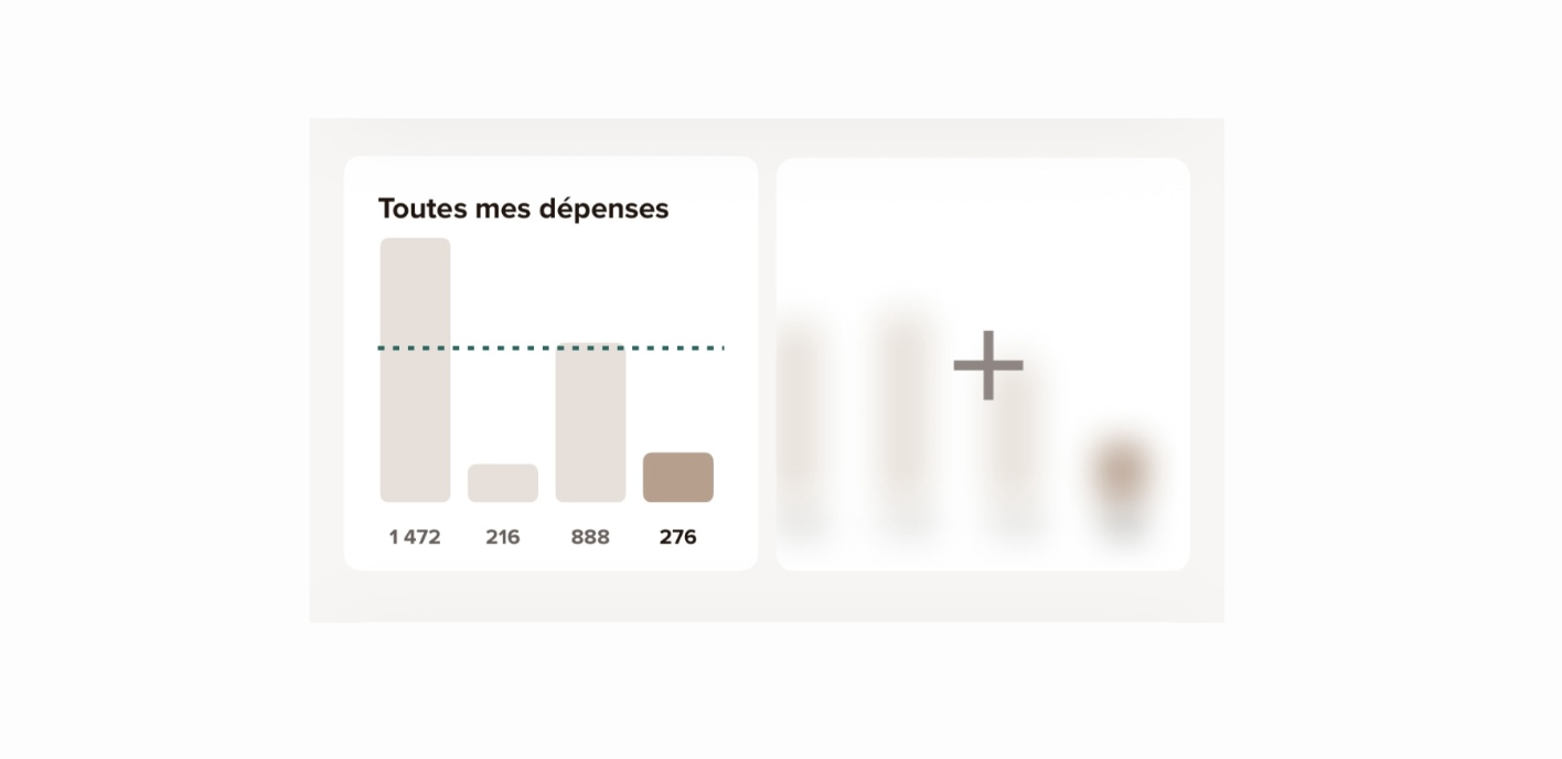
A bar chart on the “Payments” tab displays the total amount of expenses per week across all of the customer’s Sumeria accounts.
It can be customized to track a specific account or a particular spending category.
Only expenses are taken into account, i.e. cash outflows such as card payments, direct debits, or transfers, but not transfers between accounts.
A dotted line shows the average amount spent over the last five complete periods displayed.
The data presented is for informational purposes only and is calculated based on recorded transactions. It may vary depending on processing and update lead times.
Customization Options
- Accounts
- Categories
- Period: month or week
- Recurring payments: include or exclude detected recurring payments.
And to reflect the purpose of the chart, its name is customizable.
Making the most of multiples views
Here are some suggestions for a comprehensive analysis:
- Compare monthly en weekly spending:

- Compare personal and joint account expenses:

- Compare expense categories:

These visual tools are intended for educational and informational purposes.